今天有朋友问我这张海报里的字体是什么,看着很像 Futura,但是小写 ‘a’、‘g’、‘m’和‘n’ 都很明显跟普通的 Futura 不一样。截取了局部到 WhatTheFont! 里搜了搜也没找到结果。
不过最终还是通过各种办法找到了:这个字体是 Architype Renner(有的版本也叫 AEG Renner),是按照 Paul Renner 上世纪二十年代设计 Futura 时的原稿重制的。
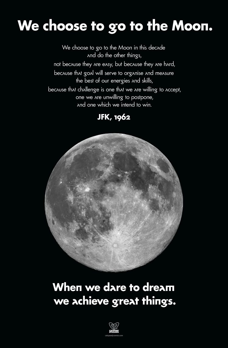
 (图片来自 Grafik: Renner Futura by David Quay)
Futura 这几个字母的特别设计在很多书中也有提到,前几天看过的 Helvetica forever: Story of a Typeface 中讲到 Futura 时就提到:
[…] Bauer had several alternative letters for Futura. The originally planned, radical geometric variations of the a and g were soon removed from production. (p.117)
另外一本字体学名著 The Elements of Typographic Style 更详细地讲述了这几个很另类的字母的来龙去脉。
[…] But the Futura that the Bauer Foundry had issued was a timid incarnation of Renner’s original design. Renner drew many alternate characters; Bauer issued, for each letter, only the single most conventional of Renner’s several forms. (p.202)